We shift gears from recent posts to address a critical – and extremely timely – decision: choosing a health insurance plan, which you must do by 12/15 if you want a new plan in place by 1/1/15. If you’re a finance professional, you will be doing your coworkers and your friends a huge favor if you can help them through this important and expensive decision. And data visualization plays a big part in this task.
Suppose you’ve gone to the appropriate websites and identified your insurance alternatives. This simple table summarizes the key features of each one:
Plans 1 and 2 are generally similar, with Plan 2 offering a lower deductible at a higher premium. Plan 3 has lower deductible, lower out-of-pocket maximum, and a lower coinsurance rate, but a significantly higher premium. Plan 4 is an unusual one: you pay 100% of your medical expenses up to $5,000, and none after the first $5,000.
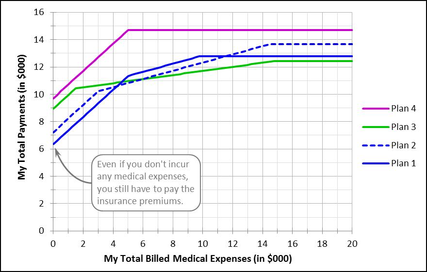
How should you decide between these plans? One way is to build a simple model that calculates your own total payments at different levels of total billed medical expenses. A graph of that model, for each of the four plans, for total billed expenses between $0 and $20,000, would look like this (to see the model in a little more detail, click here):
You’d probably reject Plan 4, since your total payments – including both premiums and coinsurance – are higher at any level of total billed medical expenses are. For the other three plans, the least expensive choice depends on how large a medical bill you run up. But at least now you can make a reasoned choice, based on your best guess of what your total billed medical expenses are likely to be. Which plan would you choose?
Before we go back to looking at Republicans and Democrats in the U.S. House of Representatives, we’ll have one more post to discuss some of the wrinkles that might also affect how you view your healthcare insurance decision. It can be complicated, but this is an important decision for millions of us, and a simple model like the one shown above is a great place to start.


