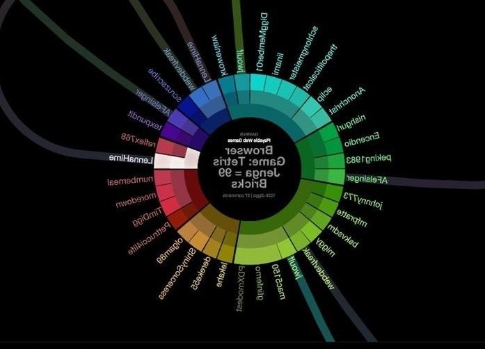

Do you use a data visualization tool to communicate financial or other information? Excel is an obvious example but other than that, which one do you use?
Answers
It depends on the audience. My experience non-financial people respond better to charts and graphs. Execs need numbers; while Boards needs graphs. I stay simple -
With today's ease of data integration we should be encouraging our organization to integrate our information platforms and allow systems to do most of the work. There will always be a place for the 3 financials statements in communicating financial information, but visualization can communicate key points so much faster and with improved accuracy. Two good choices we use and that integrate with most systems are Domo and Tableau.
I can echo both Regis and David with some research. According to new independent research on long-range planning, companies with purpose-built software (vs. Excel) are 80% more likely to make better capital investment decisions. Of course, I am biased for Planview (a FP&A tool for visability, planning, and scenarios), but depending on the objective, there is a wide array of "purposes" that now have "purpose-built" solutions. Can you be a little more specific?
Here's a link where Proformative is hosting that study:
https://www.proformative.com/whitepapers/benchmark-study-long-range-planning-steps-develop-more-effective-process
There are a wide variety of data visualization tools out on the market. The question is, what are you trying to do? At my organization, we use a wide variety of tools. Our own software, Metrics that Matter, employs data visualization best practices in our reports. We color code to make the critical information “pop” and provide different display methods (reports vs. dashboards vs. cross tabs of data) to enable different user to customize their views (a key principle in data vis). When we go beyond MTM we use both Excel (which has a lot of visualization capability and can be quite effective if you harness its power) and Tableau for more sophisticated, multi-dimensional and interactive views. The key consideration for data vis: one size does not fit all. Use the right tool for your needs and follow data vis principles regardless of the tool you choose.
We use JMP, a product of SAS. JMP is very robust in statistics/analytics.
Less robust in stats but easier to use, Tableau and Spotfire are very good data viz products.
Stephen Few's second book, "Now You See It" is an excellent guide to producing good data visualizations.
I have found that visualizations help both finance and non-finance people to "get it." There are exceptions, like the
Not every visualization is effective. Here are some basics:
• Simplify your visuals. Use ink and colors only to convey information and not to decorate or obfuscate.
• No 3-D and no pie charts
• Eliminate grid lines or make them fewer, thinner, lighter
• Same for axes and labels
• Choose graphs that are appropriate to the data:
FOR USE
Time series Line graph
Ranking Bar chart
Distribution Histogram
Correlation Scatter plot
 1
1
I am looking into Tableau -- there is a good free trial to give you an idea. Looks very promising to me, not only to present data to others, but to detect trends and patterns in your own data that you may not have realized.
